In a most arresting passage of Alan Power’s essay in ‘Tayler and Green 1938-1973: The Spirit of Place in Modern Housing’, he describes one of the main differences between Tayler and Green’s approach and the ethos of ‘mainstream’ Modernism. It is worth quoting at length:
During the 1950s, the Sublime, as expressed by the Corbusian slab blocks at Roehampton, was the dominant aesthetic for modern architecture all over the world. It most often took the form of a repetitive, unemphasised grid, although this was varied by a different version of the Sublime in the heavy architecture of Brutalism. Among the broader definitions of the Sublime is the inhospitable or unhomely, a category arising from the German ‘unheimlich’, which has a variety of meanings, explored by Anthony Vidler in ‘The Architectural Uncanny’ (1992). This has been convincingly proposed as a way of conceiving modern architecture as a whole, but if it were to be accepted, Tayler and Green’s refusal to indulge the Unhomely, or its close relation, the Sublime, would become their distinguishing feature.
A ‘refusal to indulge the Unhomely’…We have already seen that privacy was a key consideration in site planning, with screen walls or carefully placed bungalows used to prevent overlooking of back gardens from the street – and the way people lived in the houses was of great interest to Tayler and Green. They were very pleased with residents’ positive reaction to the innovative through-store – which ‘provided ample space for mud-caked gum-boots, for the storage of home-grown food and for gardening tools’. Indeed they took the whole issue of gardening very seriously. It is said that Tayler came to prefer brick (when it was more readily available) over painted render, because it acted as a more sympathetic backdrop to the vibrant flower-beds favoured by many tenants, and a simple painted wooden trellis – in a variety of patterns – became a firm feature of most house entrances.

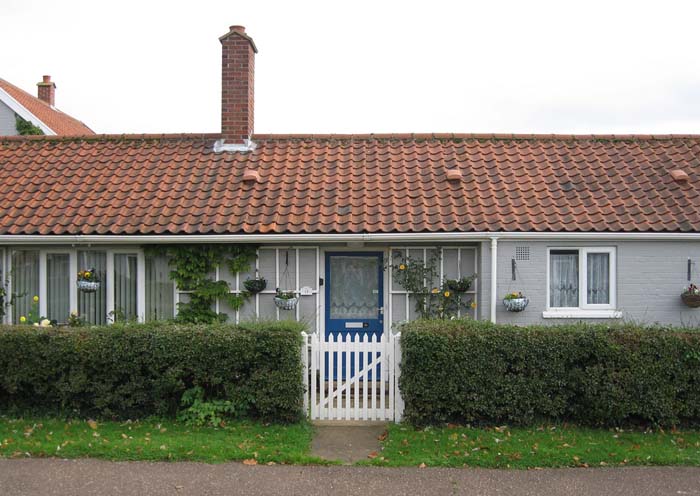
Single-storey cottage at Brook (Photo: Citizen Al)
This can all be seen as a part of the enjoyment of colour pattern and decoration discussed previously; it was an enjoyment Tayler and Green believed was normal. In 1996 Tayler reflected:
We realised, having broken away from the international modern stuff, functional style if you like, that people lacked decoration and enjoyment in the look of the houses, and so we introduced sorts of colours, different colours for each house, brick patterns, dates – the date of the terrace in the raised brickwork, and this was an immediate success. Everybody liked it; people do like decoration.
If le Corbusier had exhorted architects to ‘create the spirit of mass housing’, to design flat-roofed ‘machines for living in’, Tayler and Green politely declined, preferring to design houses that looked just like houses. In fact, as Alan Powers suggests:
….they made every building type into a version of a house or home.
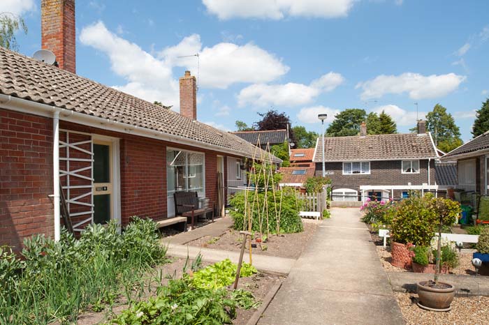
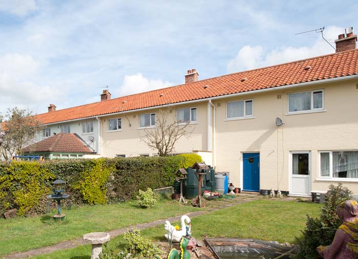
Below: Davy Place, Loddon, and Windmill Green, Dicthingham
(Photos: Jim Stephenson – clickclickjim)


Next post: ‘Tayler and Green #11 – Critical Regionalism‘
