The observations I’ve made so far about the Norfolk landscape and its built forms (my four archetypes) might be interesting to some of you in their own right, but what I’m really interested in is how they might inform how we design new buildings, settlements or landscapes in a rural context – specifically Norfolk, in the first instance – not in a superficial way, to do with stylistic details, but trying to get at the underlying ‘rhythm’ or ‘flavour’ of the built environment. I’ve got some examples of what I mean lined up, but first I want to look at some more ‘roofs across fields’.
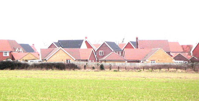
I took this picture of a housing estate on the edge of Wymondham about five years ago. I ought to re-take the photo, because I’m sure this rather brutal vista has been softened somewhat as the trees on the boundary and in these houses’ back gardens have grow up a bit. That said, the picture shows roofs across fields, quite literally, but it doesn’t have that quality of ‘hunkering down’ that I described in the previous post. There is one obvious reason for this, and two slightly less obvious reasons.
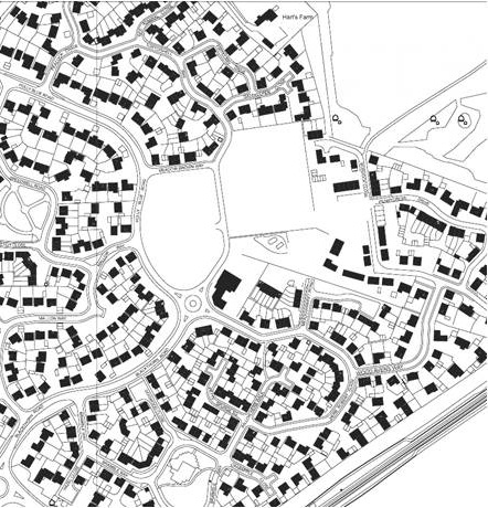
 The first problem is one of density. Compared to a ‘real’ Norfolk village, this estate is dense. Under PPG3, the relevant Planning Policy Guidance in force when it was designed, new residential developments had to be planned at 30-50 dwellings per hectare. The plan of the estate shows a fairly uniform density. I’m guessing its around 35-40dpha overall, so you’re looking at an ‘urban edge’ that’s about twice as dense as your typical Norfolk village, maybe more, which means that as this estate ‘matures’ there’s not much room for trees to intervene and break up this mass of roofs.
Secondly, and more subtly, if you inspect the plan of this estate closely you’ll see that the plan of each of these (predominantly) detached houses is roughly square. If you remember your high-school geometry you’ll know that a sphere has the lowest ratio of volume to surface area, and a cube is the next best thing if you want a rectilinear form. If a house-builder could build a spherical house it would have the lowest ratio of (expensive) external wall to (valuable) internal volume (could be interesting!). However, a cube is a more workable form, and gives a good low ratio of external wall to floor-space. Until relatively recently (as more literal pastiche of traditional forms has become popular), most volume house-builders’ standard house-types were roughly square on plan. This means that compared to our archetypal wide-fronted house the roofs of these modern houses look as tall as they are wide, rather than long and low.
Finally, up until the end of the C19th, almost all houses in Britain were arranged with their long face, and therefore their eaves, running parallel to the street. It was Raymond Parker and Barry Unwin in their paradigm-shifting design-work in the ‘Garden Cities’ (Welwyn, Letchworth, Hampstead) who popularised the deliberate use of the street-facing gable to break up the ‘monotony’ of eaves strung out along a street. Without knowing where the idea comes from, I’m sure, modern house-builders (and perhaps planners) can’t bear to see more than two adjacent houses without a gable or large dormer facing the street. This confusion of orientation probably contributes to the cacophony of roofs we see in this modern version of ‘roofs across fields’.
So; design lessons learned? If you want your new urban edge (should that be rural edge?) to fit naturally into its rural context, (1) watch out the density isn’t too high, (2) think about the aspect ratio (length:width) of the roofs, and (3) don’t go too crazy on street-facing gables. That’s my hypothesis; I haven’t had an opportunity to test it yet. If you can offer me supporting or contradicting examples I’ll be delighted to hear from you.
More about ‘Roofs Across Fields’ here.
